Action Row
A container for a row of interactive components. It can hold up to 5 buttons or a single select menu.
Discord’s Message Components V2 allow you to build rich, interactive messages with complex layouts. This guide provides a quick reference for all available components.
Layout components help you organize and structure your message content.
Action Row
A container for a row of interactive components. It can hold up to 5 buttons or a single select menu.
Section
Displays text content alongside an “accessory” component (a button or thumbnail).
Container
Visually groups a set of components together, with an optional colored accent bar on the side. It basically looks like an embed, but doesn’t have the same fields. It can also be spoilered.
Separator
Adds vertical spacing and an optional visual divider line between other components.
Content components are used to display static information like text, images, and files.
Text Display
Displays Markdown-formatted text, similar to a standard message.
Media Gallery
Displays a gallery of 1-10 images or other media items in an organized grid. Media items can be spoilered.
Thumbnail
A small image, used as an accessory in a Section component. It can be spoilered.
These components allow users to interact with the bot. With the exception of buttons used as a section accessory, all interactive components must be placed within an Action Row.
Buttons trigger actions when clicked. They must be placed in an Action Row or used as an accessory in a Section.
Buttons in SupportMail can have different actions:
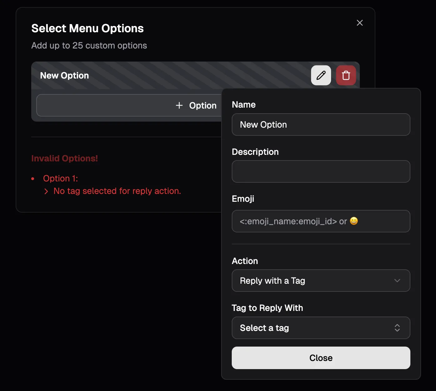
A Select Menu can hold up to 25 custom options. A user can only select one option at a time.
When editing select menu options errors will be displayed and invalid options will be highlighted with a striped background.
A select menu option can have two types of actions:
Components V2 also bring along new components for forms (modals). SupportMail’s forms support the following components:
This allows for much more interactive and dynamic forms compared to the previous version. Discord continues to expand the capabilities of modal components, however it usually takes a few weeks for the library used to build SupportMail (discord.js) to support new features after Discord releases them. Since discord.js also usually has bugs, new features may take longer to be usable in SupportMail.
No. SupportMail uses Components V2 for its messages usually. There are only a few exceptions where regular embeds are used. However, you have to decide for one - you can’t have both on the same message. It’s either content + embeds + action rows or components V2 only.
You can refer to the official Discord documentation on Message Components for detailed information about each component type, their properties, and usage guidelines.
However, this is a developer-focused resource, and may not be very user-friendly for non-developers.